




This article launches a new series following up on the few technical posts about digital imaging that were on my former website, fplanglois.com.
For a long time, I've wanted to address the issue of display accuracy across the various screens we own.
While today's barrier to entry for a complete underwater photography setup easily exceeds ten thousand euros—sometimes even tens of thousands—it has always baffled me to see photographers, instructors, competitors, or simply enthusiasts invest so little money and effort in developing their skills when it comes to colorimetry.
Even without retouching, selecting images on an inaccurate screen is risky at best. However, it gets far worse during post-processing. Retouching a photo on a poorly calibrated screen—or one that isn't calibrated at all—is like practicing watchmaking in the dark.
We have all experienced those PC screens where color and brightness shift as soon as you move your head by 30 degrees. Put simply, these displays—which use TN panel technology—are entirely unsuitable for imaging.
Here is a quick story. The week before a French underwater photography championship, my PC suddenly broke down. I rushed out to buy a replacement in a hurry, with the screen technology as my sole criterion. An IPS display with wide viewing angles seemed like a sufficient requirement for simple image culling.
I calibrated this new screen with my colorimeter (display calibration probe) and reviewed my images. It was a complete disaster: they all looked thoroughly desaturated.
At this point, we need to dive into a little bit of theory.
We'll need to familiarize ourselves with the terms gamut, native color space, and standardized color space.
- Gamut: This is a set of colors—specifically, the complete range of colors that a device or system can display, capture, or print.
- Standardized color space: A system that standardizes the definition of a specific set of colors (the gamut mentioned above).
- Native color space: The raw, maximum gamut that a device is physically capable of capturing or reproducing.
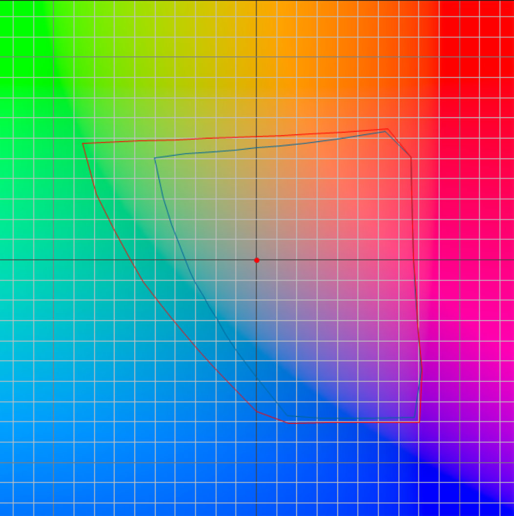
Standardized space is a vital standard you cannot do without. You choose it (or accept it if imposed by your device) based on your workflow. There are many available; the most common is sRGB, which was created in 1999 as the smallest common denominator across digital devices. Since it has a small gamut, one might assume that more than 25 years after its adoption, every device would be capable of rendering its entire color volume. As we will see, that is still far from true.
 |
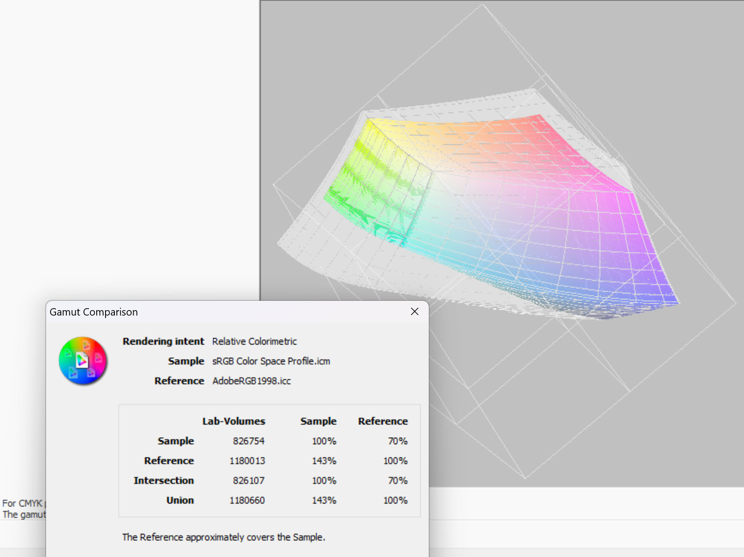 |
Comparison between sRGB and AdobeRGB standardized color spaces
Native space can be larger or smaller than your chosen standard space. Knowing its boundaries is essential to making the most of it, which is precisely the goal of calibration.
There is another concept you need to know, and I'll keep it as simple as possible: Color Management. This is a precise technical term, not a vague concept.
It defines the mechanisms for converting from one color space to another:
- from a native space to a standardized space, or vice versa (from a standardized space to a native space);
- from one standardized space to another standardized space.
A concrete example:
- Your camera captures an image in a native space far wider than sRGB.
- Thinking like a pro, you set your camera to the AdobeRGB standardized space because it is significantly larger than sRGB.
- The camera automatically applies color management to convert the image from its native space to AdobeRGB.
- You import your image into Lightroom, which knows your screen's calibrated native space. Lightroom applies a new round of color management from AdobeRGB to the screen's native space.
- After editing, you save your image in sRGB so it displays with accurate colors on as many web screens as possible. Once again, Lightroom relies on color management mechanisms to perform this conversion.
Of course, this is just one example. A straightforward option is to set everything to sRGB.
So, what happened with my new computer that displayed such disappointing images?
It is worth noting that the screens on my two previous PCs had a native color gamut close to 100% of sRGB. Standards can be genuinely useful! In fact, because all my photos were shot in sRGB, I had disabled color management in my cataloging software, XnView (ah, the triumphs and trials of photo competitions ! (1) ).
On those older computers, toggling color management on or off made almost no visible difference when viewing images.
However, when I analyzed the ICC profile generated by the colorimeter on the new laptop, I discovered that this IPS screen—despite having the right technology—covered only 59% of the sRGB gamut.
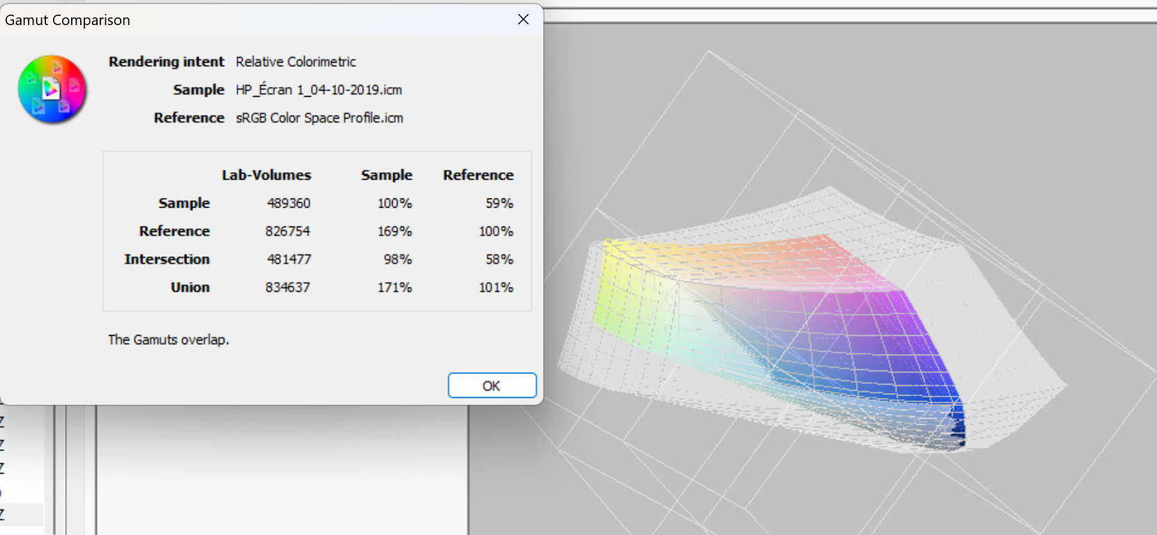
[Insert 3D representation of the disaster here: the faulty screen's native space in color, the sRGB space in shadow]
Before analyzing the profile, I had opened an image in Photoshop, and magically, it looked acceptable again. It wasn't good enough for serious color grading (something I rarely do anyway, and which isn't permitted in competitions), but it was sufficient to appreciate the image and decide to add it to my favorites.
This experiment demonstrates that color management saves the day by precisely adapting a photo's colors to the target color space.
As an aside, at the time of writing, the Windows 11 desktop background still doesn't support color management. This offers a quick way to gauge your screen: if your sRGB wallpaper looks oversaturated, you have a wide-gamut display; if it looks washed out—as it did during my little misadventure—your display is severely limited.
I own a Samsung Galaxy Book Ultra laptop with an OLED panel that covers 98% of the AdobeRGB color space, as well as an Eizo ColorEdge monitor (a professional graphics display with a built-in colorimeter for hardware calibration). Yet, on both devices, the Windows desktop wallpaper appears far too saturated.
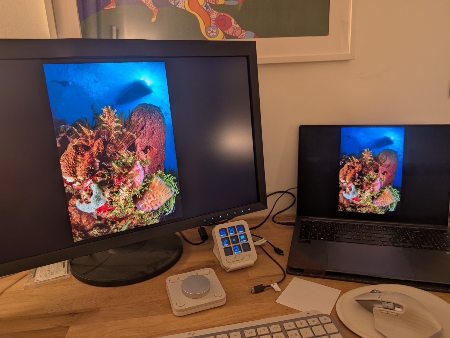
However, once the image is loaded into image-processing software—where color management functions correctly—the same image displayed simultaneously on both screens looks identical, without oversaturation, despite the difference in display technology.
Rest assured, modern web browsers all have color management enabled by default.
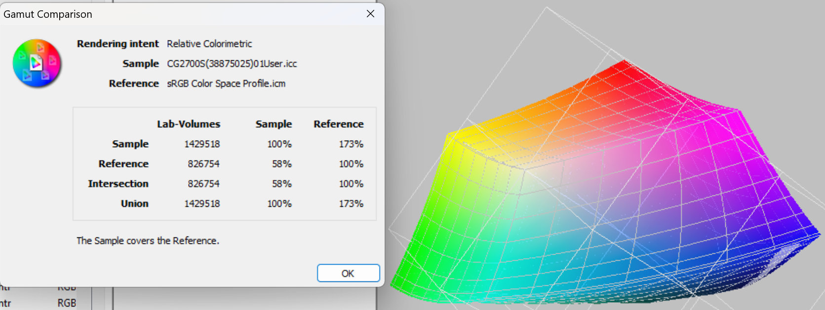
[Insert high-end graphic arts monitor gamut here: The sRGB reference space is invisible because the screen's native space completely swallows it (exceeding it by 173%)]
This brings us to the main takeaway: you must calibrate your screen!
There are two types of calibration, depending on the display you use.
I mentioned hardware calibration earlier. We can skip that for now—it applies only to high-end professional monitors that most people don't need.
Standard calibration isn't the polar opposite of hardware calibration; it isn't a simple "hard versus soft" debate. Both methods require a display probe (a colorimeter).
Using the software provided with the probe, you perform two distinct tasks across two steps:
1. Calibration
This is the initial physical step. It involves adjusting the monitor itself (via its physical buttons or OSD menu) and selecting target parameters in the software.
Example: You adjust brightness (e.g., $120\text{ cd/m}^2$), guided by the probe until you hit the mark, and set target values for contrast, white point (e.g., D65 / 6500K), and gamma (e.g., 2.2). These are standard targets for sRGB displays.
Don't worry: probe software provides clear, step-by-step instructions for beginners.
2. Characterization (Profiling)
For the next phase, the software and probe run automatically without requiring any input.
The software displays a series of color patches on screen while the probe measures the delta between the expected theoretical colors and the actual displayed values.
As it progresses, the software logs the display's inaccuracies and saves this data into an ICC profile. Through this measurement process, it identifies all the colors the display cannot render, defining the screen's actual gamut.
3. What happens next
Your operating system uses the ICC profile generated during characterization to correct graphic card output on the fly, ensuring colors render as accurately as possible. However, colors may still be missing—sometimes many of them. On high-end displays, the opposite happens: the screen can render far more colors than your image files contain.
This is where color management (see above) in supported applications (Photoshop, Lightroom, XnView, GIMP, and your web browser) steps in, mapping your image files' color ranges to fit as seamlessly as possible within your display's native space.
(1) In competitions, photos are judged on screens about which nothing is known. Here again, it is best to stick to the standardized sRGB color space.